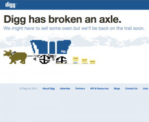
 Do you hear that sound? That’s the sound of the Venture Capitalists invested in Digg being hit in the stomach. That nauseous feeling they all have in their stomach is caused from the recent change of Digg from it’s original design of user submitted content to it’s new look filled with major publisher content. A move that has single handedly ended the popularity of the site in one week.
It looked like a great move. Revamp the site, integrate major online publishers with the user submitted ( I use “user” lightly, it was always power users) content, and make a little more money. The result is t major publishers pushing all the original submissions out of the way and creating a slow, regurgitated display of the top Internet stories. A look you can get already get on ten other sites like Google News.
Five years ago if you wanted huge traffic to your site there was one site that could deliver. Digg. It was every site owner’s dream to get to the front of Digg. It meant tens of thousands of readers to your site and hundreds of links. While this meant huge numbers of users for Digg itself, the site wasn’t nearly as profitable as sites like StumbleUpon that had a revenue model that allowed website owners to buy views. So Digg decided to start offering publishers the ability to go straight to their front page.
The result over the last few days since the change has been amazing. In the history of the Internet their has never been a mass exodus of users from a major site. Every story , regardless of content , is full of comments stating user’s anger about how much they hate the new site. “This Sucks” and “Digg Sucks” are the most common term used in each and every comment on the front page. To add to the problem, the recent criticism has led Digg to mass ban users who are complaining. Sifting through the comments you will see hundreds of “this account was closed”.
Many a site or company has tried to redesign a brand. The often used example is New Coke. More often than not, the companies end up going back to the original design or concept after a major proportion of consumers showed their dislike of the change. Digg most likely isn’t going back. The reason. Kevin Rose spearheaded the change and there is nowhere to go. The site was stagnant and was getting its butt kicked by Facebook, Twitter, and Reddit. He and his investors feel that Facebook and Twitter have stolen their thunder and saw this as a last attempt to stay relevant in today’s online world. Why they would try and become the same thing as the companies that are eating their lunch is beyond me. Supposedly their was a ton of recoding put into the new site. New coding that actually slowed the site down and presented the user with what investors wanted, not them.
So Goodbye Digg. As a owner of sites that you helped build and a formerly dedicated user I say thank you. Thank you leading the net to what it is today, I wish you could have joined us. To the investors I say I’m sorry. I’m sure your next investment will do better. If you’d ever like to get in touch with your former users, we’ll be over at Reddit.

Snap, crackle, pop! Had no idea this was going on. The new design feels too much like Google News. I think you are very head on with this.
The users are striking back by sending reddit.com stories to the front of Digg LOL http://i.imgur.com/ioYx7.png
This will for sure a good news for other social bookmarking websites.
I thought somebody hacked the site and made it look like Facebook!
I used to visit the site daily since 2005. I saw the launch of Digg on The Screen Savers in 2004.
Well reddit is still a fraction the size of digg. I dont think they are going to die and the whole publishing going to the front page automatically I guess was a problem with the new algorithm. But who knows, I think the design is better then the old one personally.