Web users love pretty. After pretty come functionality. Here are a few sites that combine both. As domainers, web development is not our forte, but as parking revenue free falls, domain owners are realizing there is opportunity above and beyond a little hasty mini-site. Beauty is only part of a site. We need good SEO and an easy to use backend. Many of these sites have WordPress backbones with custom coded fronts (I’m changing my sites over to this format) that give them a very unique look with a easy to use editor. They’re the kind of sites that make you say. Man I wish my site was that cool.
![]() Icon Dock: I absolutely love the checkout system. A simple drag and drop system that allow you to scroll through the icon you’d like and drop it into the checking cart. See what you’ve purchased and how much you’ve spent. Simple and easy. This is certain to be the future of checkout.
Icon Dock: I absolutely love the checkout system. A simple drag and drop system that allow you to scroll through the icon you’d like and drop it into the checking cart. See what you’ve purchased and how much you’ve spent. Simple and easy. This is certain to be the future of checkout.
 Darkchild.com I’m not sure that the site and content is that special but the backdrop picture is fantastic. Absolutely grabs your eye and just a great look. Certainly brands and identifies the site. The depth and detail of the picture is great.
 Ma.tt One of the coolest domain hacks of all time but when you are the founder of WordPress you have lots of cool things like…..money. Matt Mullenweg had a French designer (who didn’t return my emails) design what is one of the prettier sites on the internet. I really like the torn paper header and the scribbled highlight when you choose a function.
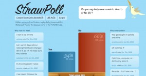
 StrawPollnow: The colors are the same as pretty much every new startup on the Internet but I love the simplicity of the site. Polls in the middle: Reasons on the side. Nothing else to distract you other than the very cliche baby blue sky backdrop. But then again it IS a twitter based site so maybe it works
DropBags.com A beautiful site. The header first caught my eye with a nice centered logo and not your typical left sided logo. I don’t even need the bags and I found myself looking through the site. They sell only one product so they were smart and kept the site simple. Site keeps everything above the fold without looking crowded
 AndreasHinkel.com (Celtic Football Club) Users love movement. They just don’t want to wait 12 minutes while the flash loads to create a site that moves. Andreas’ site is very fast loading and after it does is beautiful. When you hove over a section it shakes and jiggles. Just enough that it doesn’t look silly but lets you know where your cursor is. Looks like he’s using meta tags to make up for front page content but I’m certainly not an expert in this.
![]() The Pixel. One of the cooler pages on the net. The twirling propeller gives the site a “fancy” feel and is completely unique. Everything from the icons to the way the blog is divided out using the limbs is well thought out and designed.
The Pixel. One of the cooler pages on the net. The twirling propeller gives the site a “fancy” feel and is completely unique. Everything from the icons to the way the blog is divided out using the limbs is well thought out and designed.

