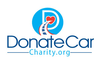
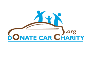
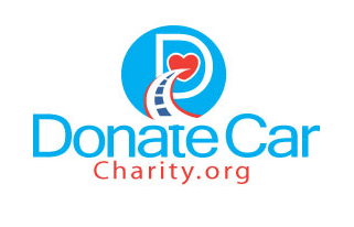
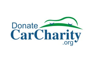
I’ve got a new site I’m working on DonateCarCharity.org. Long story short, I got to talking to someone about donating cars to charity and how big of a business it was. Like everything I do, I started looking for more information and the tax benefits of donating. Next thing you know I started looking for a domain and this is what I chose. I’ve had a logo designed and I can’t decide which one to go with so I’m asking your help. I’ll go with the most popular choice so please vote in the comments. First is 1 on down to number 4
Domain Spotlight:
Jan 03
2011
Domain Spotlight:
44 Replies to “I Need Help Picking A Logo”
Comments are closed.


I say go with number 2
I’m torn between 2 and 4. They’d be easiest for print!
number 2.
#1 and #3 looks like the site is Charity.org and #4 looks like the site is CarCharity.org. #2 is the only real option.
#1 is the closest for me but there is something about “D” in the background that throws it off, imo.
1 and 3 remind me of healthcare focus.
Number 4 is “epic fail”.
Number 2 is the best of the four but it has weak points despite its creativity of putting the wheels on the letters.
I’d say, ask your designer to work on it some more; the colors aren’t inspiring (gold never works well as it’s close to brown, cyan is too light and doesn’t work with gold anyway) and the use of a family group of silhouettes is a bit cheesy.
I like #1 the best visually, but I agree it would be best to have the domain all along one line, so it doesn’t look like just ‘Charity.org’.
not to be rude but… do you really think a domain that bad is worth putting any effort into at all? just sayin’.
We’ll see but thanks for the opinion. look at the searches for that exact term. You may be surprised
I’d choose #1. I like the idea of a car in the logo, but that brown color kills me.
I only like the second one – agree with Acro. Maybe you could use the D as a headlight – almost looks like one on the image anyway and then you could have the C’s from Car and Charity be the wheels… might throw off the one line, but worth looking into.
2, but I’d try out some different colour combinations (don’t think that brown works)
I like #2. Yes, people are cheesy but so what. And i would agree that the brown has to go. But I like #2 best of all.
#1 and #3 look like lips to me for some reason. Like Tia said, something on those is throwing me off.
#2 but different color than the brown
I like number 4) Clean & simple, nice colours
The rest have too much going on IMHO
#1.
I’d have to go with #1 but I like them all except for the last one.
What Gazzip said. This will have to translate to the smallest space (like a Facebook profile or domaining-like profile icon). Less is more.
I like number 2, I think having the car in the logo is important.
A few reasons why #4 is “epic fail”:
* Use of an arched swoosh – that’s so 1999
* Is that car circa 1935 from nazi Germany?
* Fonts used are Arial & Times – was it made in Word?
* Colors – if you use green and blue together it’d better have enough contrast
* Spacing of words – almost as if the domain is CarCharity.org
* Because I said so
From a branding point of view, logo number 4 is the best. Less is more when it comes to branding, look at the top 100 logos globally to see what I’m talking about. Here’s a site that shows some of these logos: http://blog.designcrowd.com/article/130/famous-logos–top-100-brands-keep-it-simple
That said, I think the car in logo number 4 is a bit too abstract. It should be clearer in it’s shape.
Symbols in logos should be clear and simple. Anyone that looks at this symbol should instantly recognise it as a car.
Luke – simple does not mean fugly. When resorting to branding, use a professional. Remember the recent GAP blunder.
Another point I wanted to make:
Using the URL in the logo is a good move, but as some others have mentioned, splitting the full domain name across multiple lines is bound to see prospective users going to other websites like ‘CarCharity.org’.
Using your web address in the logo makes sense for this venture, but you do have quite a long domain name which makes it hard from a logo design perspective.
You’re right Acro. However from a branding point of view – from the selection above, number 4 is the most effective in my opinion.
That said, it does have some issues, as I mentioned.
Incidentally, number 1 and 3 are the logos I like the least.
Way too much going on in the design.
Acro,
Thanks for the feedback and you won me $10. I knew you would have issues. In my entire life I have never met a designer who didn’t think they could do better. I could give you an Ansel Adams and you would say it needs more color. But that’s what we love about you and all designers. You take a lot of pride in your work. On the other side, it becomes very hard to tell a prideful designer you don’t like their work. (not saying I don’t like your work)
No 2 for me!
Shane – There are basics that are essential when designing a logo. When presenting several logos as options, it’s easy to find which ones fit and which do not, if you follow these basic principles. Remember also the equation: CLIPART + TEXT != LOGO
Hi Shane:
I like #1.
However, I would keep the font the same color for clarity.
By the way, who did these?
Nice work.
Mark
No 2 but with a better color replacing the brown…..
Responses of many to logo choices have you do. Hrrrrm?
Yup, I even have Yoda chiming in. 🙂
#1 logo decent looks but away take letter D and mixed with people blue element of #2 logo car not present might better decent be. The domainer force strong with this one is.
Def. No. 4
I like them all.
I’ll choose #4 for you, and #1 for me
#4 offers the clearest, quickest grasp of the domain, in my opinion.
#2 – The family aspect is nice.
Not crazy about the location and size of the “.org”. Will this be used on printed materials as well? Consider how it will look at business card size.
I didn’t readily pick up on the letters as wheels until I read someone else’s comment.
Element that work (IMHO) are the car and family. I’d work in that direction.
Just my two cents.
I’m curious what was in your creative brief to the designers and how much you paid for these Shane. I’d have the ‘designers’ do a few more rounds of revisions.
I definitely like #2. #4 if you quint hard enough makes the car look like an unhappy face.
All the best.
#2 !
#4 by a mile!
Numero Uno senor Shane, loooose the “D” (agree with Tia on that one)
No. 2.
I agree that the “charity.org” part stands out a bit too much in #1 and #3, but I like those best in terms of the graphics. I could easily see #1/3 being used on stationery, t-shirts, etc. The colors pop more than the others, and I like the typography. Don’t like #2 at all and #4 is just…wrong.