If you’ve ever built a site or app (or even a home) then you’ll know that the second you release it, you want to make more additions or improve it in some way. Appraiso and it’s well known owner, Morgan Linton, is about to introduce the next rendition of the ever popular Appraiso. While none of them improvements are major changes, they are all responses to user wants and needs expressed since the launch.
 The first thing that caught my eye was the new logo. If you remember the other logo had the “O” as a solid letter with half of it blue. It looked like it was “Apprais” and then a logo. Its now a little clearer that the O has a hole in it. It may not seem like that big of a deal but if you are trying to draw attention to your company you want people to know your name, not 7/8 of it.
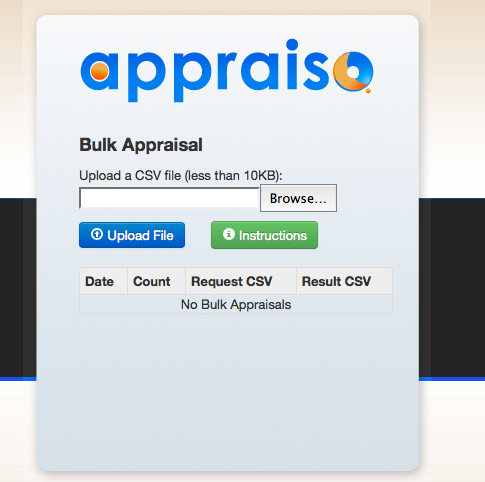
The second and biggest new introduction is the bulk appraisal. Morgan said that his biggest request was the ability to do bulk appraisals. Now a user can upload a CSV file with as many sites as they like. Once uploaded, they can save their uploads and site information for future referral. I chimed in and suggested the ability to do the same thing
online, rather than an upload, and I think its a feature you may see in the next upgrade.
The interface also gets a new look using Twitter Bootstrap. I actuality I had no idea what Twitter Bootstrap was, but I’m told its a standard user interface that’s easier to use. I didn’t think the old interface was that difficult but the new one is even nicer. I also noticed an Appraiso in the news section on the home page as well which gives users a little more feedback on how Appraiso is being used.
And finally a “bug” was fixed. If you ever tried to see the membership prices you could only see them one way. If you signed up for a free account. It was obvious from day one this needed to be changed and now its in its proper place so everyone can see pricing.
As you can see, today is just the start. What I like about Appraiso, Morgana and the team, is they are dedicated to improvement. We’ve seen so many people throw things up and let them just sit there. Many times the final rendition of a tool isn’t anything close to what it started as. It develops as the users let the developers know what they are looking for it to do. It’s not these little changes that make it a big deal, i’ts the fact that there is going to be a steady series of improvements that add real functionality. Morgan and I even had a good talk about version 3 and the next series of add ons. He’s obviously willing to listen to ANYBODY when it comes to making Appraiso better.


Thanks Shane! We are really excited about v2 and adding our #1 user recommended feature Bulk Appraisals!
Like you said, this is still the beginning. We are following the Lean Startup Approach – Build, Measure, Learn. Your feedback and that of all our users has been incredible and will continue to help shape what Appraiso is today and in the future!
Link in the first paragraph goes to appraisoN.com, fyi
We’re watching a tool evolve write before our eyes. I like how there is a free plan now as well as paid plans. That’s always a good way of reeling potential users in.
Great work!
We’re watching a tool evolve write before our eyes. I like how there is a free plan now as well as paid plans. That’s always a good way of reeling potential users in.
Thanks for the kind words Jason!
woot~ awesome