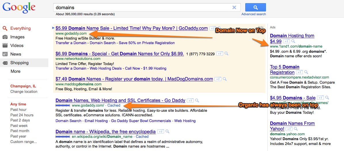
If you have done a search today you’ll notice something a bit different in the layout of the results on the landing page. The domain is now the second line after the heading with the description below. It used to be at the bottom. According to Search Engine Land this is only a test.
The change is on both Organic results and Adword ads throughout the page. Does this mean that they believe users will change their clicking habits if the url is in the first half of the returned results? Or does it mean they are just playing around with new ways of presenting data? I think it’s a little of both. There is no doubt that many companies are trying to develop awareness of their domain name and brand. As they build that brand name it’s in their best interest to have the domain presented as soon as possible as the user reads the results. I’d like to say it’s a big deal but I actually thought that was how the organic results were already displayed. I didn’t even notice the difference. My first thought was that Google was merely trying to make the ads blend but soon realized all results, both ads and organic, originally had the url at the bottom. So it obviously didn’t change my clicking habits.
Only Google and the AdWords buyers will be able to tell you if the experiment works. If Europe is any indicator then it works. because the new display has been in effect for a few weeks now.

The Old Layout Below

I think it means that they are bored just like the way they play around with their logo. 🙂 Some people play around with what is not important because they made so money while many play around with what is not important because they couldn’t make any money.
I noticed this a couple weeks ago. Maybe they rolled it out in batches by IP???
I’m noticing you and others just now stating this is new as of today.
I’m not real observant when it comes to Google. Every time I look up something looks different 🙂
I noticed this too. I would think it has to do more with branding. The placement makes it very clear to the user where they will be directed, even before the description of what’s offered.